Editor’s Note: Sponsored by Monday Properties and written by ARLnow.com, Startup Monday is a weekly column that profiles Arlington-based startups, founders and funders. The Ground Floor is Monday’s office space for young companies in Rosslyn. The Metro-accessible space features a 5,000-square-foot common area that includes a kitchen, lounge area, collaborative meeting spaces, and a stage for formal presentations.
 Inspiration for the next startup can come from an unlikely source, as many founders know. For Data Illustrate founder Matthew Fischer, it came from a grad school project mapping out how the characters from the Harry Potter books would live on.
Fischer and his classmates were trying to use data to map out the future. They soon scrapped the project, but the data tools they were using, it turned out, gave him the idea for his next company, one that specializes in making real-time data easy to analyze and retain.
“After doing the grad school project, I continued doing research, talking to industry leaders and figuring out where the market was going,” Fischer, also the founder of Control A+ told ARLnow.com. “The market of data visualization is still growing.”
The company was started in the summer of 2013, and since then Fischer and two colleagues — one in Utah and another San Diego, Calif. — have built the company’s infrastructure. Data Illustrate is just starting to take on clients, for whom it takes complex data sets and simplifies them into infographics, motion graphics, mini-documentaries and data visualizations.
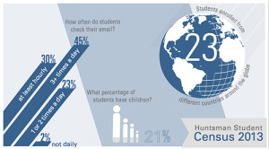
 Infographics are static illustrations of statistics, like the pictured student census, left, taken from Data Illustrate’s website. Motion graphics are infographics but the pictures move to create more audience engagement. Mini-documentaries have become increasingly popular with the rise of Kickstarter, which encourages all companies to include a video explaining the premise of the fundraiser.
Data visualization allows clients to “see your data tell its story in real time,” which Fischer describes as a kind of “Doppler radar for any kind of data.” That means a trucking company that tracks where its trucks are can have an easily consumable visual instead of data points on a computer screen.
“Infographics tell an author’s story,” Fischer said. “Motion graphics tell a story and add motion. Mini-documentaries bring a human factor to the story and data visualization gives the reader information to make their own story.”
Fischer says he see the biggest opportunity to grow his company in the nonprofit sector, with organizations trying to break through the masses and make an imprint on donors, members and any other interested party.
“We can create art to share their story with more people and garner a higher retention rate,” Fischer said. “Nonprofits work with a lot of statistics, and we can share those statistics in a way that more people will retain.”
In fact, that’s the company’s tagline: “Retention is our game, art is our median, data is our speciality.” Unlike some big data and analytics companies, Data Illustrate doesn’t have a simple algorithm they simply plug each client into; they create tools and back-end construction for each individual project.
 “We don’t believe in ‘one size fits all,'” Fischer said. “A lot of these questions demand a custom answer.”
The visualizations, custom packages and work-intensive processes to get to this point mean that Data Illustrate isn’t quite ready for primetime. Fischer and his team are accepting clients, but starting in January, he expects to make a big marketing push to grow the portfolio.
By this time next year, Data Illustrate could find itself with a new specialty, new offering or new angle; such is the life of a big data startup.
“We’ve only tested about 10 percent of the limits we can reach,” Fischer said. “We’re beyond early adopters with Big Data and the future is going to take a multidisciplinary approach to look at insights data visualization could bring to companies and individuals.”


