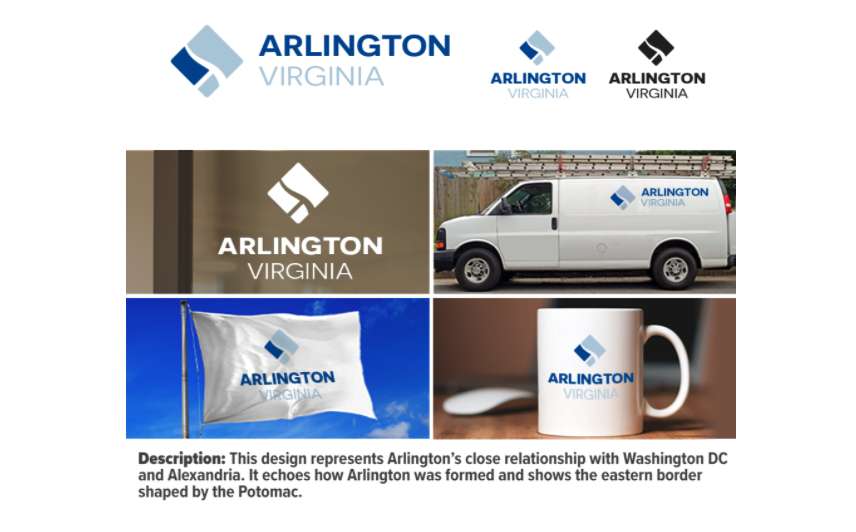
Arlington County officially has a new logo.
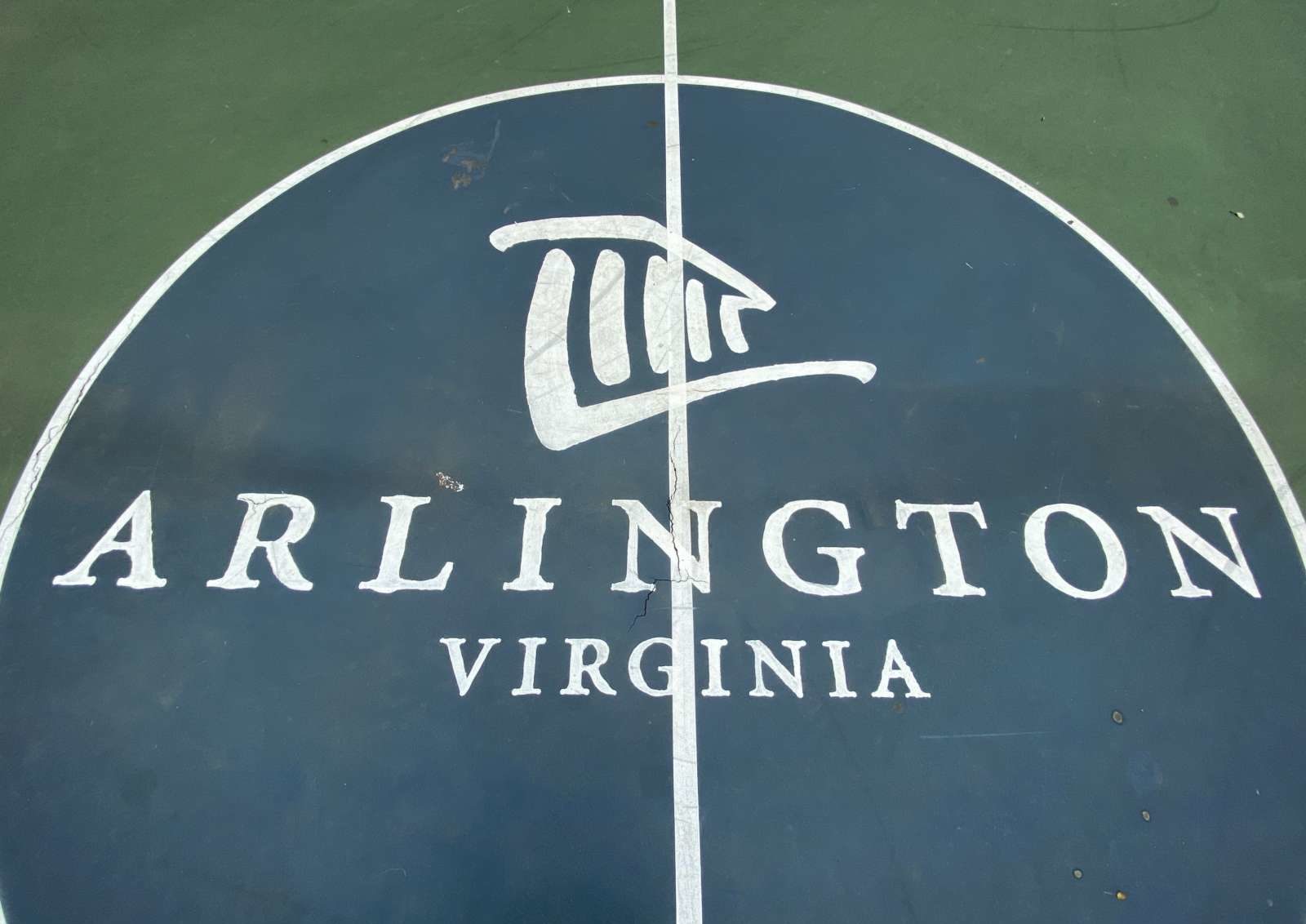
The Arlington County Board voted unanimously at its Saturday meeting to approve the logo favored by county staff, concluding a nearly nine-month-long process to replace the previous logo, which depicted Arlington House, the former home of Confederate Gen. Robert E. Lee.
More from a county press release:
In an effort to find a new symbol that represents Arlington’s values and assets as a community, the County Board voted 5-0 to adopt a new logo. The final choice, which represents Arlington’s close relationship with DC and Alexandria and echoes how Arlington was formed from the original Capital borders, comes after a months-long community engagement process in which residents were encouraged to submit ideas and then submit their preferences on top options that aligned with the County’s guidelines. More than 16,000 Arlingtonians shared their top choices in the most recent round of public engagement.
Last year, the County Board approved a process to replace the County logo and seal, which depicted Arlington House, The Robert E. Lee Memorial. For many residents, the home of the Confederate general is a painful representation of the slavery that took place in our region. Community members submitted hundreds of ideas for Arlington County’s new logo during two rounds of submissions earlier this year, which was then evaluated by a Logo Review Panel and further enhanced by a professional design firm to find images that best depicted the unique assets and values of the County and presented for public input.
More than 400 logo designs were submitted by members of the public, the county said.
Arlington County has a new logo! The County Board voted on the new logo Saturday — after more than 400 design submissions & 29,000 votes in two rounds of voting. The design represents Arlington's close relationship with DC and Alexandria and echoes how the County was formed. pic.twitter.com/mTv2eFXKAf
— Arlington County (@ArlingtonVA) September 18, 2021
The new logo appears to be a variation on a more minimalist design submitted by a National Geographic documentary producer.
https://twitter.com/alexwenchel/status/1439310850389684226?s=21
Putting aside whether you would have preferred the original design — or the previous county logo — to the modified design that ultimately was selected to adorn everything from county flags to vehicles to stationery, what do you think of the new logo?


