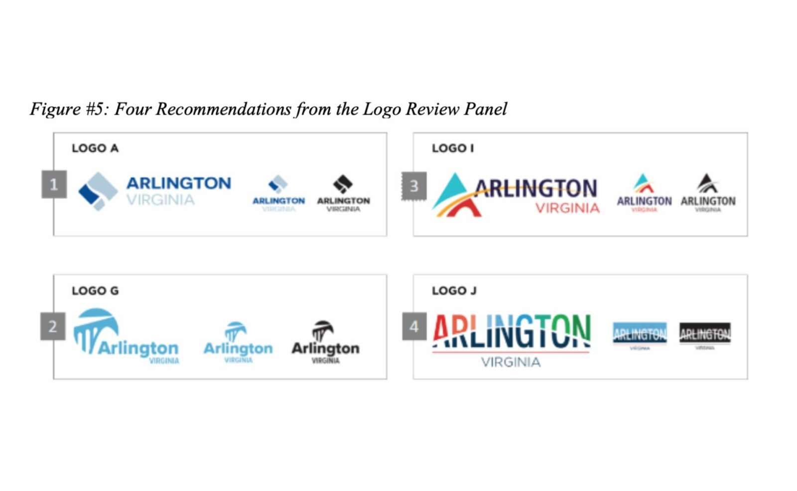
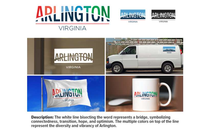
The four final logo design recommendations are in, meaning the process of picking a new logo to adorn county flags, vehicles and stationery is nearly over.
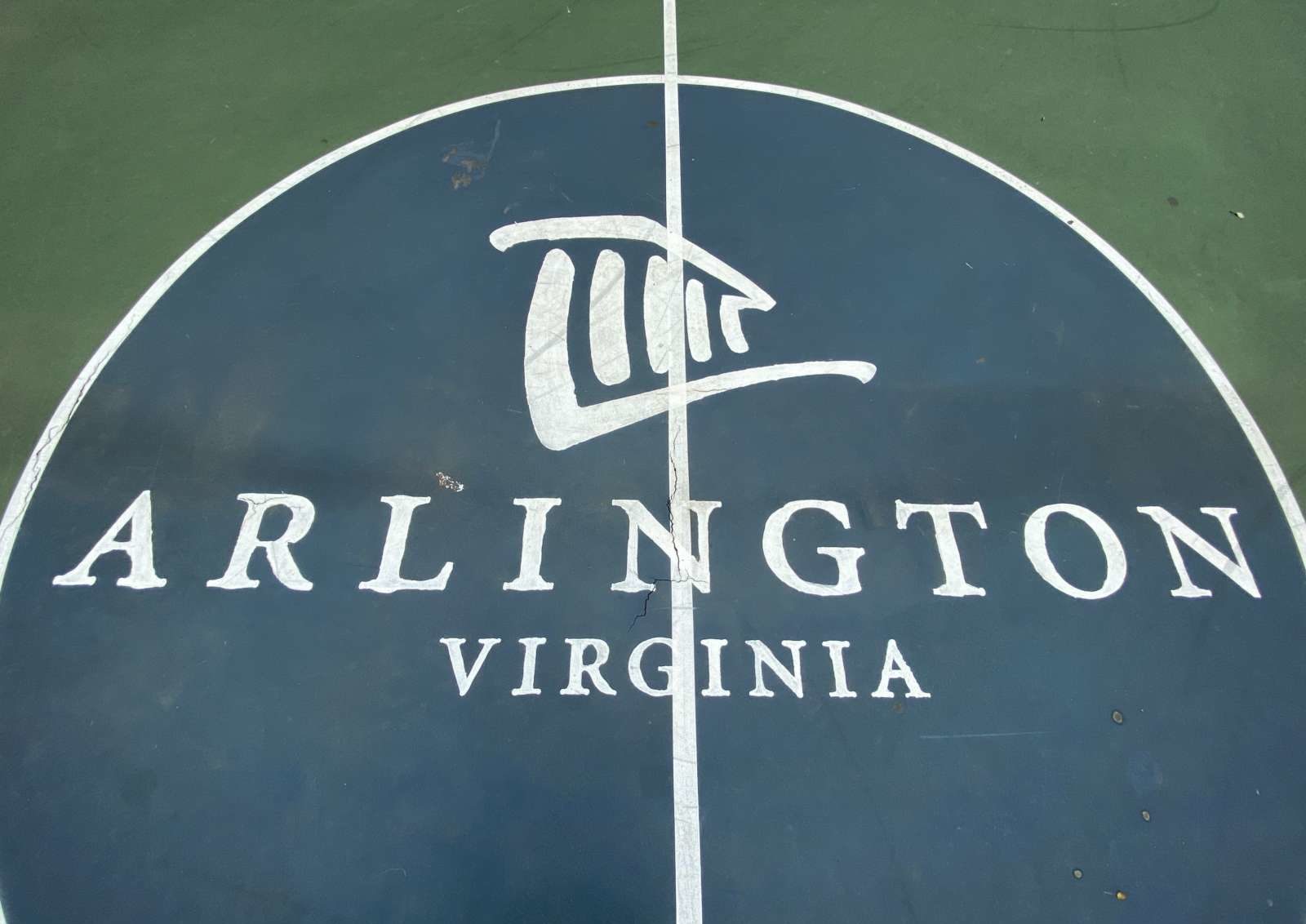
This Saturday, the County Board is slated to choose a logo that will replace the current logo and seal, depicting Arlington House, the plantation house of Confederate General Robert E. Lee at what is now Arlington National Cemetery.
In the summer of 2020, the Arlington branch of the NAACP called on the county to ditch the “divisive and racist” logo, given its connection to slavery, and in December 2020 the County Board voted to kick off a process for choosing a new one.
This spring, the panel winnowed more than 250 submissions down to five that elicited some strong, negative feedback. Hearing the dissatisfaction, the County Board asked the panel to try again while allowing more time for people to submit potential logos for consideration.
The four going before the County Board this weekend include the top two from the second round of submissions as well as two from the first batch. In the second voting round, folks consistently voted for blue logos depicting the county’s geography and bridges, a departure from the colorful logos centering the county name (and possibly featuring abstract bridges).
But the logo that got the most community votes is not the Logo Review Panel’s first choice. Here’s how 16,082 survey respondents ranked their top three choices from the second round of voting:

It turns out that bridges, although a common motif, caused some controversy.
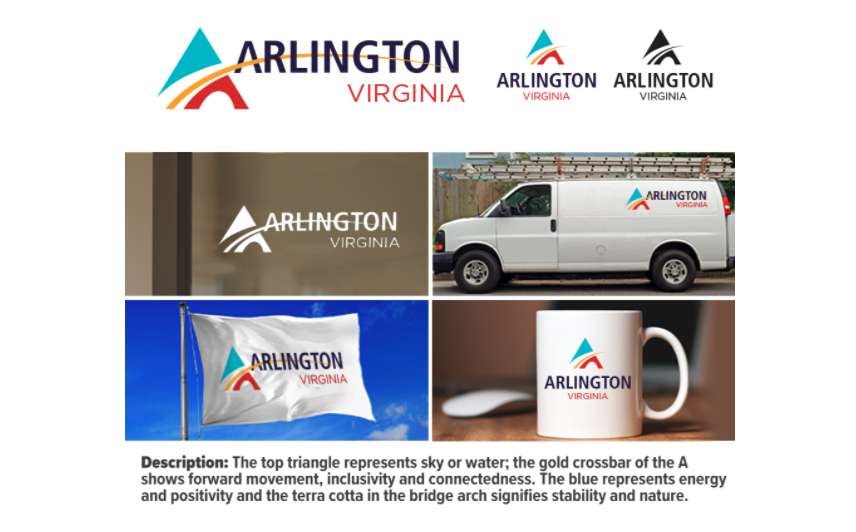
The third logo, which depicts the Key Bridge, was nixed because “it came to the attention of the logo panel late in the process that Francis Scott Key was a slaveowner,” a county report said.
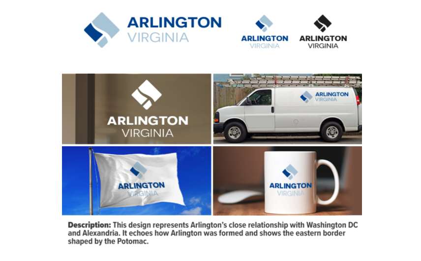
The county report did not say why the Logo Review Panel switched the first- and second-ranked logos — favoring a two-color design that abstractly depicts the geography of Arlington, D.C. and the Potomac River — but it did explain why the panel decided to keep the more generic bridge.
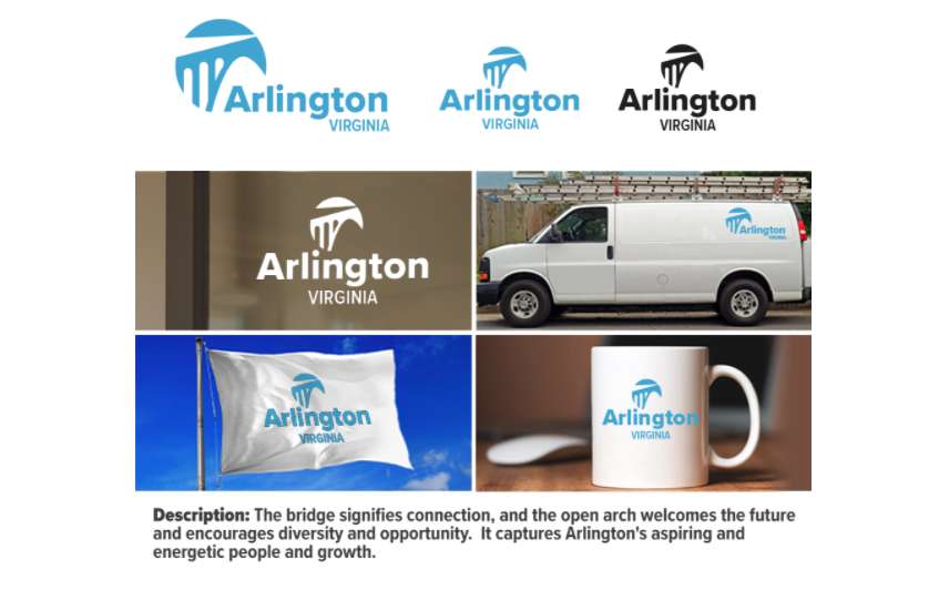
The panel determined the other bridge “was not based on a specific bridge, and was meant to signify ‘connection, and the open arch welcomes the future and encourages diversity and opportunity,'” the county report said.
References to the Key Bridge came to the fore during the second round of voting in part because local designers were asked to avoid federal monuments and state symbols, as the panel decided they did not represent what makes Arlington distinct.
Those who wish to speak at Saturday’s meeting about the logo choices can register to do so. Once the County Board chooses a design, it will consider a timeline for phasing out the current logo and seal. That will happen in stages as time and maintenance schedules allow.
“The new County logo will be introduced in all electronic media as quickly as time permits,” the report said. “Replacement of the logo on all vehicles, signs, and other materials will take place as materials are replaced over the coming years… Replacements of logos that appear on free standing signs and entrances to our buildings will be done within current building maintenance budgets over the course of time.”
So far, the costs for consultants, trademark-related fees and outreach during this process total $50,000, the county staff report said.


